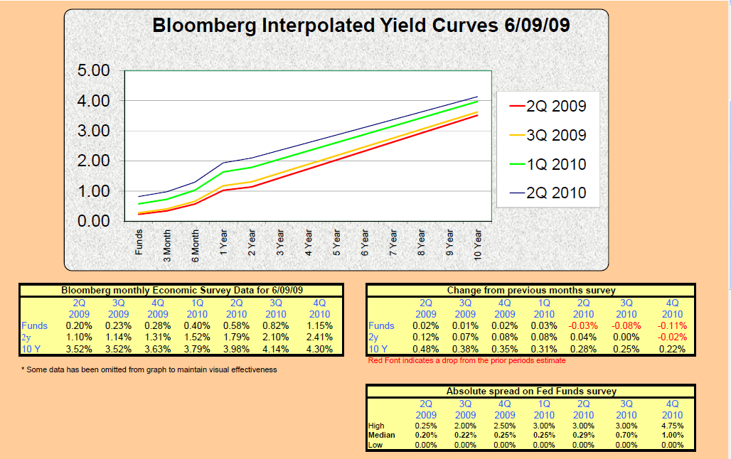
Each month Bloomberg surveys 60 to 70 economists to get their estimates of where Fed Funds, the 2-year Treasury, and the 10-year Treasury will be over the next several quarters. I take this data and interpolate for the points in between the survey data to create the attached report. This allows us to get a broad view of where various economists see interest rates going over the coming quarters.
It appears that we’ve not been alone in calling for a steepening of the yield curve. The Bloomberg survey data has also been trending toward a steeper curve over time. As of yesterday the yield curve was trading with 356 basis points separating Fed Funds and the 10-year Treasury. The analysis that follows points out that this is quite steep by historical standards. How long will this last? Will it get steeper? What does it mean to me? Read on. In the following analysis I highlight some trends to consider as we move through this cycle.
What did they say six months ago?
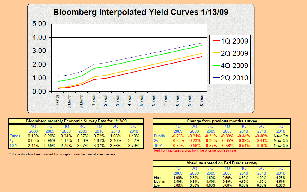
Below I’ve attached the Interpolated Yield Curve from January of 2009. In the “furthest period forecast” for that survey (looking out to 3Q 2010) the average forecast showed a curve with 236 basis points separating Fed Funds and the 10-year Treasury.
The current survey “furthest period forecast” shows 315 bps of spread between the overnight rate and the 10 year.
How steep does the curve get?
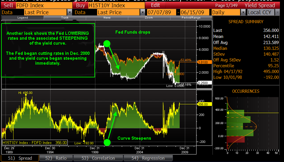
A quick look at the history books is in order here. In the chart below I’ve run the historical spread between the Fed Funds index and the 10 year Treasury. This measures the steepness of the curve. The higher the number of basis points between these two instruments, the steeper the curve.
You can see from the chart below that the current yield curve (far right) is in an area that history shows to be among the steepest. With a current spread of 356 bps between Fed Funds and the 10 year Treasury we’re clearly at levels that are among the highest we’ve seen over the last 20 years.
Keep in mind that the bottom panel of the chart below represents the SPREAD between Fed Funds and the 10-year Treasury. A high number means a steep curve and a low number indicates a flat curve, a NEGATIVE number indicates an inverted curve. As you see the line dip from a high toward a low you are looking at a FLATTENING of the yield curve. The bottom panel just shows the spread.
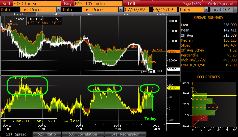
Putting both halves of this screen together gives you a very good feel for how the shape of the yield curve changes in association with changes in the Fed Funds rate.
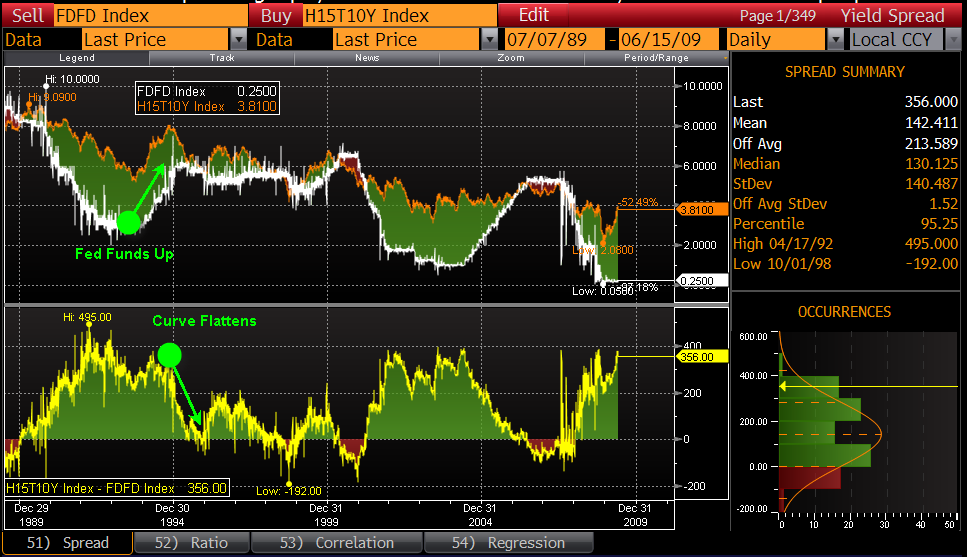
The white line in the top half of the graph below represents Fed Funds. I’ve pointed out a period that shows Fed Funds rising (white line on top half of page) along with the reaction of the Treasury Curve (yellow line on bottom half of page). As the white line rises the yellow line eventually drops. This is just a picture that illustrates the relationship between Monetary Policy and the yield curve. When the Fed lowers rates to spur economic activity it will eventually lead to inflationary concerns and the curve will again become steep (buyers of long term bonds require more yield to compensate them for the higher expected inflation). The economy will eventually heat up causing the Fed tighten again to fight inflation and the curve again becomes flat. This is just the cycle of monetary policy…the Fed using rates to combat inflation.
In December of 1993 Fed Funds were at 3.00% and the 10 year Treasury was trading at 5.78%, so we had a spread of 278 basis points between them. Beginning in December of 1993 the Fed began tightening aggressively, raising the overnight rate to 6.00% over the next 14 months. After that tightening we had Fed Funds at 6.00% and the 10 year Treasury at 7.44%. The spread between them was then 144 basis points.
The Fed tightens like this to control expected inflation. A 300 basis point hike in the overnight rate is powerful medicine on inflation, the market understands this and reacts by pricing in less expected inflation on the long end of the curve (because they see the Fed acting to prevent this expected inflation from getting out of control)…so yields on longer term bonds drop.
The yield on the 10 year Treasury dropped from a 7.44% in Feb of 1995 to 6.22% just five months later. At that point the spread between Fed Funds and the 10-year was only 22 basis points. As indicated by the 22 basis point spread, the Feds actions forced a massive flattening of the yield curve.
You can see this in the BOTTOM panel of the graph below. As the Fed raises rates they squeeze the spread between Fed Funds and the 10-year, and the line trends downward indicating a flatter yield curve. Alternatively you can just look at the green shaded area in the top panel...this represents the amount of spread between Fed Funds (white line) and the 10 year Treasury (orange line).
You’ll notice several time periods where the white and orange lines are on top of each other…this indicates periods where Fed Funds and the 10-year are trading at the same yield level…a flat yield curve.
Any time the orange line is above the white line you have positive spread…the wider the spread the steeper the curve. This is all said to point out that there are a number of ways one can look at the graph below.
Below we look at a different period on the same timeline. As Fed Funds drops from 6.50% in late 2000 all the way down to 1.00% in 2003, you’ll see that the curve moves from an inverted configuration (orange line below the white line with a red shaded area indicating negative spread between Fed Funds and the 10-year) to one that is quite steep.
So what?
The first chart we showed illustrates that we’ve got a pretty steep curve right now, and we’re looking at several factors that could cause this curve to steepen even more. Adding to the uncertainty is that a steep yield curve can persist for long periods…years in fact. Big deal right? Of what practical use is this information?
At this point it is helpful to consider the way we tend to look at bonds. Everyone wants the most yield for the least risk (unless you work for the government…they tend to view this differently). At this point I’ll ignore credit risk because community banks generally don’t take a significant amount of credit risk in the investment portfolio. The two primary risks that bank investment portfolios are exposed to are optionality and interest rate risk (price risk). Since we’re at the lows of rates and most everything than could have been called HAS been called, and everyone is concerned about rising rates, this leaves us to focus on price risk. Nobody wants to go long because they don’t want to take a big hit on the price of a 7 to 12 year bond in an up 300 shock. They like the yield but they sure don’t want to be exposed to that type of price volatility.
Most everyone uses Bloomberg models that run price volatility shocks on bonds under an immediate parallel 300 basis point rate shock. This simply means that the entire yield curve shifts up or down by 300 basis points the day after you buy the bond. It’s an extreme test, it is also one that doesn’t do a great job of modeling reality. The yield curve doesn’t generally move up and down in easily modeled immediate and parallel shifts. The curve changes shape as it rises and falls. It can flatten and steepen as we move through the various stages of the business cycle, and all points on the curve don’t experience the same magnitude of movement.
Food for thought
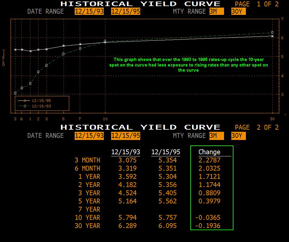
Rates up from 1993 to 1995
Let’s take a look at how rates have moved up over some recent interest rate cycles. In December of 1993 Fed Funds was at 3.00%. Over the following two years the Fed tightened until the overnight rate sat at 6.00%. Were all bonds affected equally? Was this a parallel rate shock where every point on the curve was up 300 bps? No. This was a classic flattening of the yield curve. The Fed pushed the short end up, but the long end actually fell a few basis points.
The chart below shows that the 10-year was the LEAST affected of any bond on the curve. The green line shows the December 1993 yield curve and the white line shows the yield curve in December 1995 (after the rate move). You’ll notice that the short end of the curve bore the brunt of the move. The 3 month spot was up 227 bps, the 2 year spot was up 117 bps, and the 10 year spot was actually DOWN in yield by 3 basis points.
On December 15th 1993 (just before the tightening):
- The 2-year Treasury yielded 4.20%, and received a 117 bps rate shock over the cycle which translates to a 2.3% price loss.
- The 10-year Treasury yielded 5.83%, and experienced a down 3 bps move over the cycle which translates to a 0.2% price increase.
If you bought a 10-year Treasury rather than a 2 year then you earned 163 basis points more yield AND you had less price volatility. How is this possible? It’s possible because the yield curve doesn’t do parallel shifts. There is generally a pivot point on the curve…much like a see-saw. Not all points on the curve experience the same movement.
When the Fed pushes up on the short end of the curve, the curvature of the yield curve changes. Yields on the short end will rise quickly, yields on longer bonds will tend to fall a bit, and yields on the intermediate part of the curve may not move much at all. The following example shows that after the Fed raised rates 300 basis points over a two-year period…the 10-year Treasury yield was virtually unchanged.
Are we saying to run out and load up on 10-year paper? Of course not. But this information should be considered as we make changes to the investment portfolio. Most bank portfolios have become very short over the last two years. I think the story the yield curve tells us is that diversification is still our friend…even when we expect rates to rise. If you can get some money to work at the yield levels that a steep curve offers at the 7 to 10 year spot, and history shows that intermediate term bonds can receive less of a rate shock than short bonds in a rates up move…then we have the potential to increase portfolio yield and decrease its price volatility at the same time…a textbook definition of diversification.
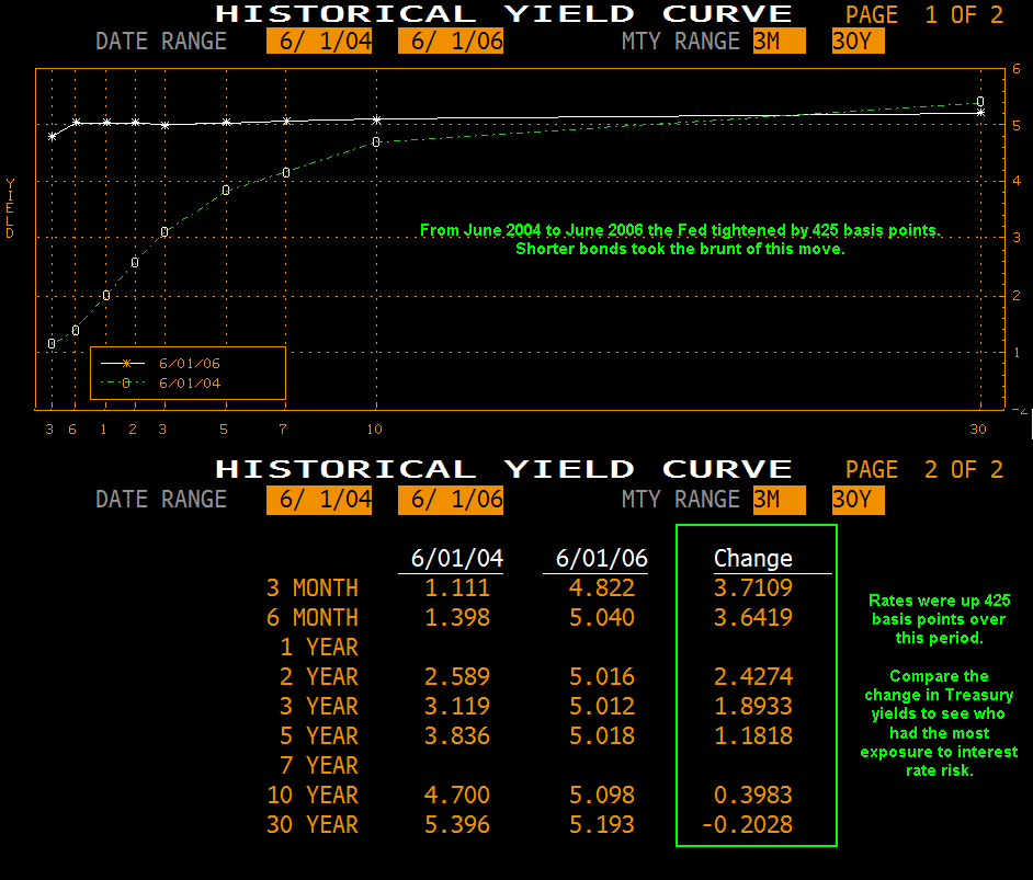
Rates up 2004 to 2006
Let’s look at another example from the graph at the top of the page. From 2004 to 2006 the Fed raised the overnight rate by 425 basis points. Again we have an example of a “pivot point” on the curve that is unaffected by rate moves…and again the shorter bonds take the brunt of the move.
The 1-Year Treasury got a 300 basis point rate shock…the 10-year got only a 39 basis point shock over the same time period. Over much of this time frame the 7-year spot on the curve served as the “pivot point” and was unchanged in yield for a long time while shorter bonds began seeing losses from outset of the cycle.
What does all of this mean to me?
This review is really a reminder to consider the big picture when making investment decisions. View each purchase within the context of the overall portfolio. Think about the risk profile of not only the individual bonds but of their contribution to the overall portfolio. How will I be affected if the yield curve remains steep for two years? How will I be affected if rates rise quickly in a year? Which bonds get hit the hardest in an up 300 flattening move? Could I pick up more yield AND reduce the overall price volatility of the investment portfolio by putting SOME money to work on the 7 to 10 year spot on the curve?
The information above is really just to provide some additional context to your decision making process. A solid understanding of how the Feds execution of monetary policy impacts the shape and level of the yield curve can lead to higher quality decisions regarding the investment portfolio.
This is not an exhaustive list of considerations, it’s merely food for thought so to speak. If I typed any longer I’d undoubtedly begin putting people to sleep. If you have any questions on this material please let me know.